Opower Website Redesign
Lead the website redesign of Opower, an energy efficiency software company
Roles
Design lead
User research
Stakeholder interviews
Information architecture
UX design
UI design
Branding
HTML/CSS
Wordpress implementation
Research
We conducted internal and external research about our brand and website and learned how our customers and internal teams viewed Opower. We learned there was a huge disconnect between how we wanted to project ourselves and how we were actually percieved. People saw our brand as tech-focused, innovative and fun, ahead of the curve. Our brand was portrayed as boring and in fact hard to understand what we did. The website was difficult to read on mobile devices and challenging to navigate.
Users
Research taught us that our users are utility industry leaders and investors. We were able to eliminate the need to appeal to utility customers as there were very little cases where this type of user would browse the site. With that said, it was important to show those customers and the connection to Opower. This would be a selling point for the utility clients.
Information architecture
Prior to the redesign, Opower had a three level top navigation system. Something we found so challenging to navigate and agreed that it clouded the users ability to make a quick and clear decision on what they wanted to learn about Opower. The navigation is also a way to quickly tell a story of who you are as an entity, with three levels of nav we were not doing this.
We developed one intentional navigation that lead the user through our site simply and clearly. We featured Products, A Why Opower section which delves into our top level offerings, our Technology which is important to sell to the tech arms of the utility companies we are selling to. They need to feel like we are easy to integrate with their system.
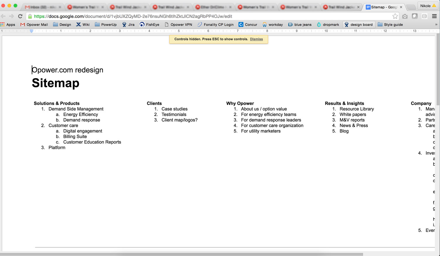
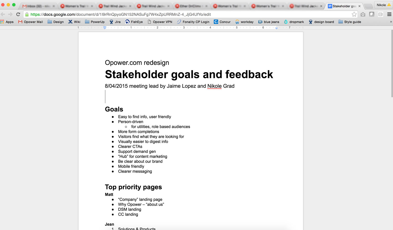
Content Maps
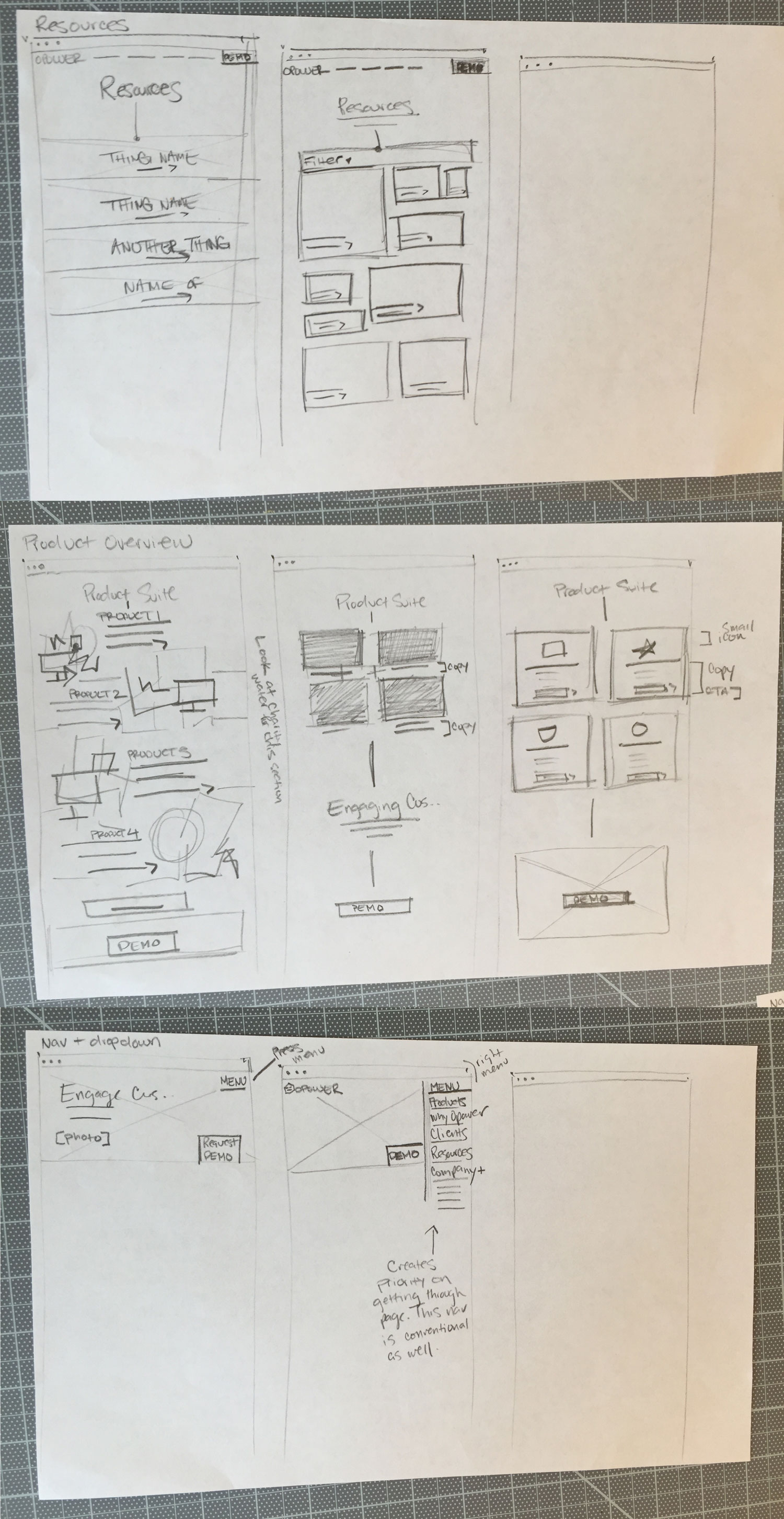
We sketched and sketched and sketched. We focused heavily on the navigation. We explored dozens of ways for it to function on mobile and desktop. We ended up landing with something as simple as the nav itself. A full width bar that ran across the very top of the browser and as you scroll down, should you choose to scroll back up, the nav would re-appear for easy access.
Collaboration
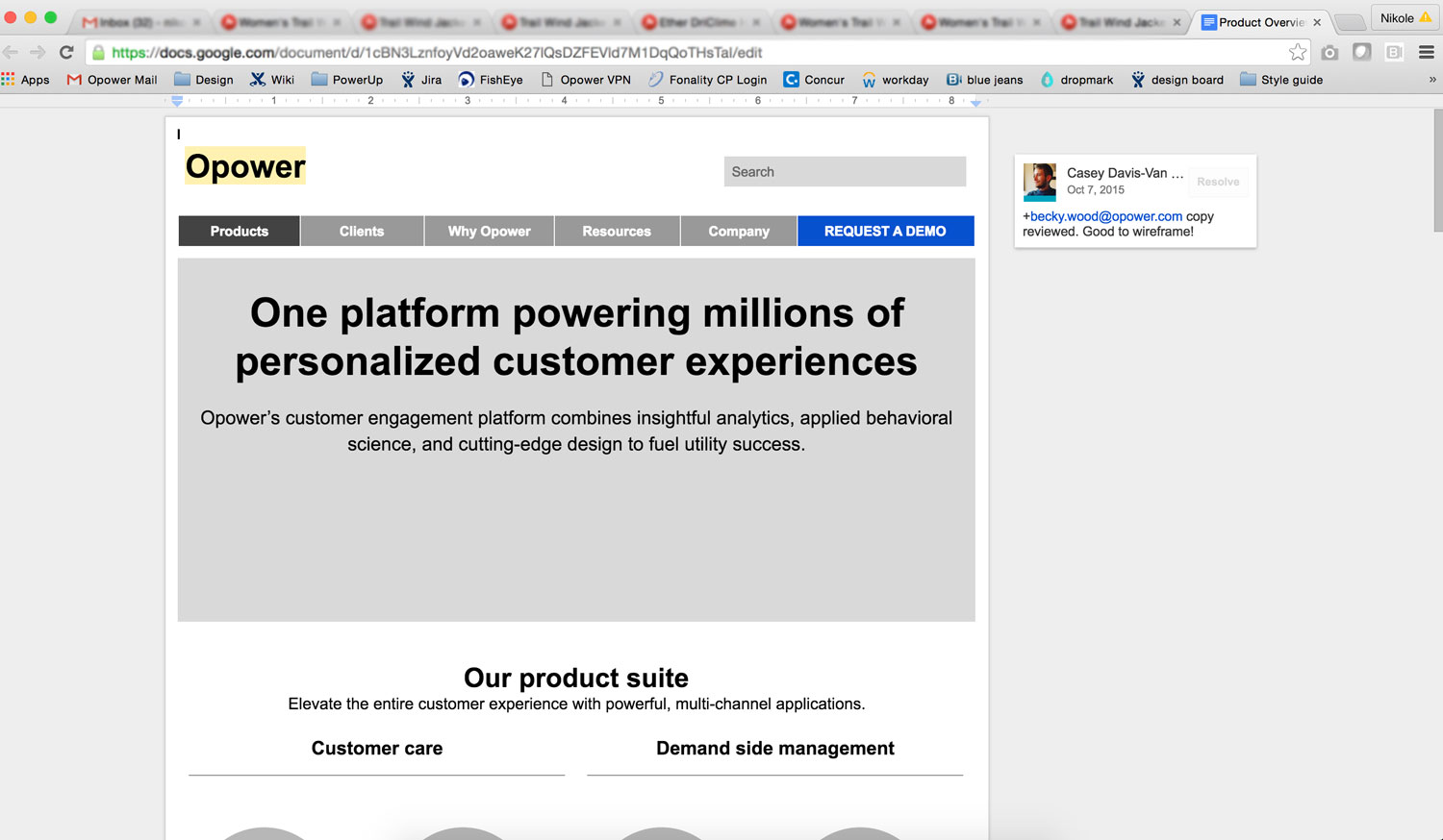
Content maps were created in a google doc which created an extremely collaborative environment between content brand, designers and our development team.

Sketch and Wireframe
We sketched and sketched and sketched. We focused heavily on the navigation. We explored dozens of ways for it to function on mobile and desktop. We ended up landing with something as simple as the nav itself. A full width bar that ran across the very top of the browser and as you scroll down, should you choose to scroll back up, the nav would re-appear for easy access.
Digital Wireframes
We used a bootstrap grid to set up the wireframes. Working on a tight timeline, our development team built out the wireframes and completed the wordpress integration with essentially no visual design completed yet. We had to provide clean and heavily notated wireframes to ensure the developers were able to get a head start.

Wirestorming for future pages
Wirestorming is an extremely effective process at crafting a first-draft wireframe called Wirestorming. Wirestorming is an innovative and collaborative way to create a wireframe, straying from the archaic notion that they are for designers and designers alone. The essential component of wirestorming is involving people across departments while wireframing to get a more complete perspective of how it should look.
As we create future pages for the website, we'll use this technique to ideate and develop the best outcome.

Element board
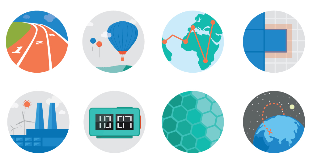
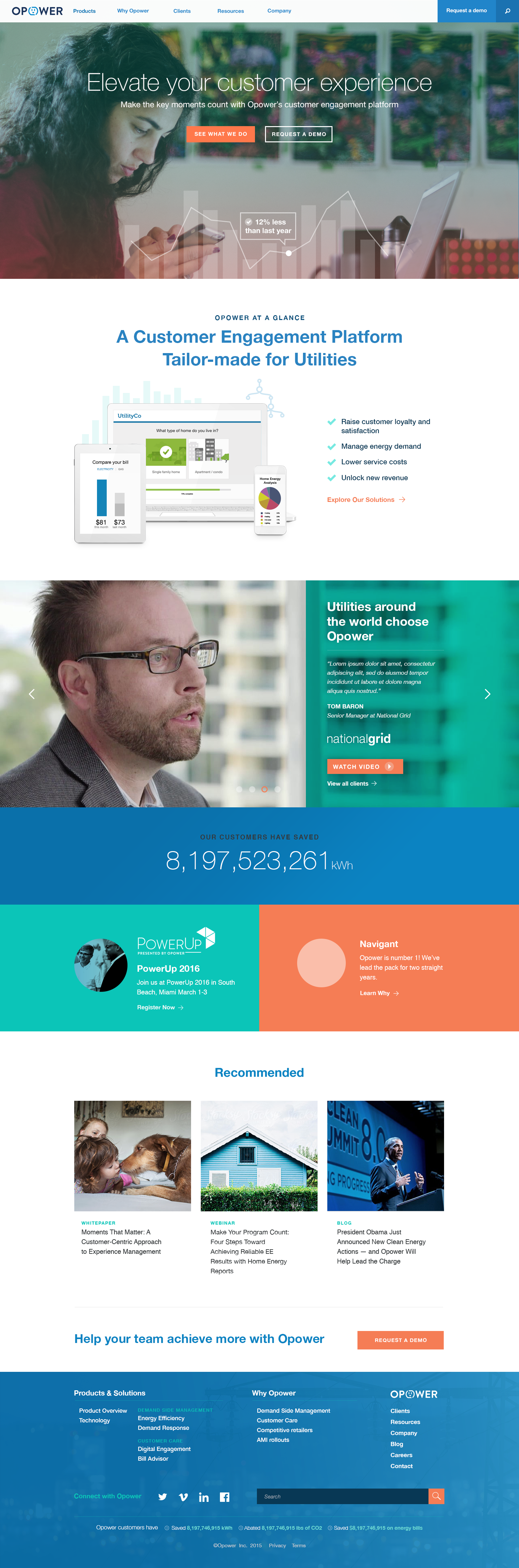
We considered design for products, the grid, photography, illustration, icons, technology and treatment of images. Our team worked collaboratively and quickly to achieve optimal success in these design areas. I lead the creation of 50 plus custom illustrations used as visual gems throughout the site to explain concepts more interestingly than just a paragraph. I also lead the creation of the hero images and the data overlays we created with these.
We had team members drawing and vectorizing custom icons for the site which supported and complimented the rest of the design elements as well.

UI Design
We considered design for products, the grid, photography, illustration, icons, technology and treatment of images. Our team worked collaboratively and quickly to achieve optimal success in these design areas. I lead the creation of 50 plus custom illustrations used as visual gems throughout the site to explain concepts more interestingly than just a paragraph. I also lead the creation of the hero images and the data overlays we created with these.
We had team members drawing and vectorizing custom icons for the site which supported and complimented the rest of the design elements as well.
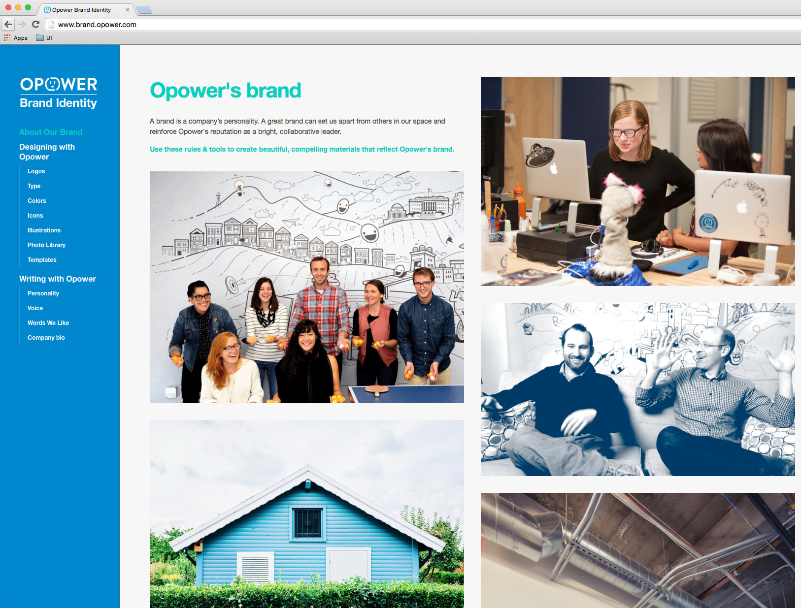
A brand resource
A brand can be beautiful and visually attractive, but it has to be practical at the same time. We collaborated and created a brand site to house design resources, illustrations and templates for Opower staff to utilize on a daily basis. Check it out here
Illustration
I created a custom hand drawn and vector illustration library for the website. From pencil and paper to the computer to SVG export, these illustrations brought the website to life.