Global Financial Integrity
A new information architecture resulted in refreshed design and brand
Roles
Design lead
Branding
Information architecture
UI design
UX design
Responsive design
Wordpress implementation
Research
We began the research phase by conducting 10-12 stakeholder interviews to understand the company and it's goals. We were able to establish constraints, items to focus on and elevate and goals for the website and brand.
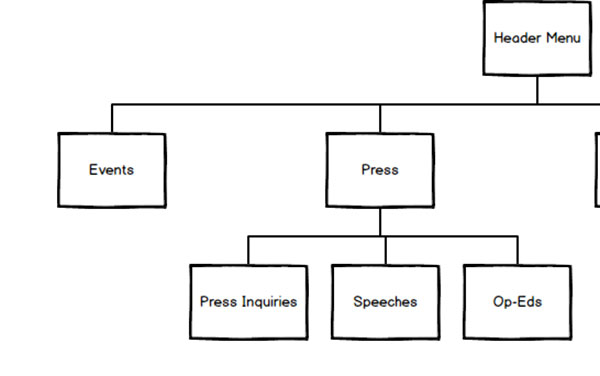
Cardsorting and sitemap
GFI fights everyday for transparency and needed two things from us: to elevate their website brand and to succinctly describe their mission, making it unwaveringly clear what their mission was. When they came to us for website redesign we rolled up our sleeves up to conduct a nitty gritty card sorting exercise to ensure thoughtful information architecture to wireframes.
Users
We established the users are: Reporters, Policy Makers, Journalists and Analysts. An audience they want to eventually reach, but not quite there yet are grass roots orgs, to create more passion and community around these issues. We kept this in mind however strongly recommended they build the design and content to appeal to the top list of people first. I kep the focus on communicating well with who we know our audience is, then phase 2 can be how to appeal to more grass roots communities.
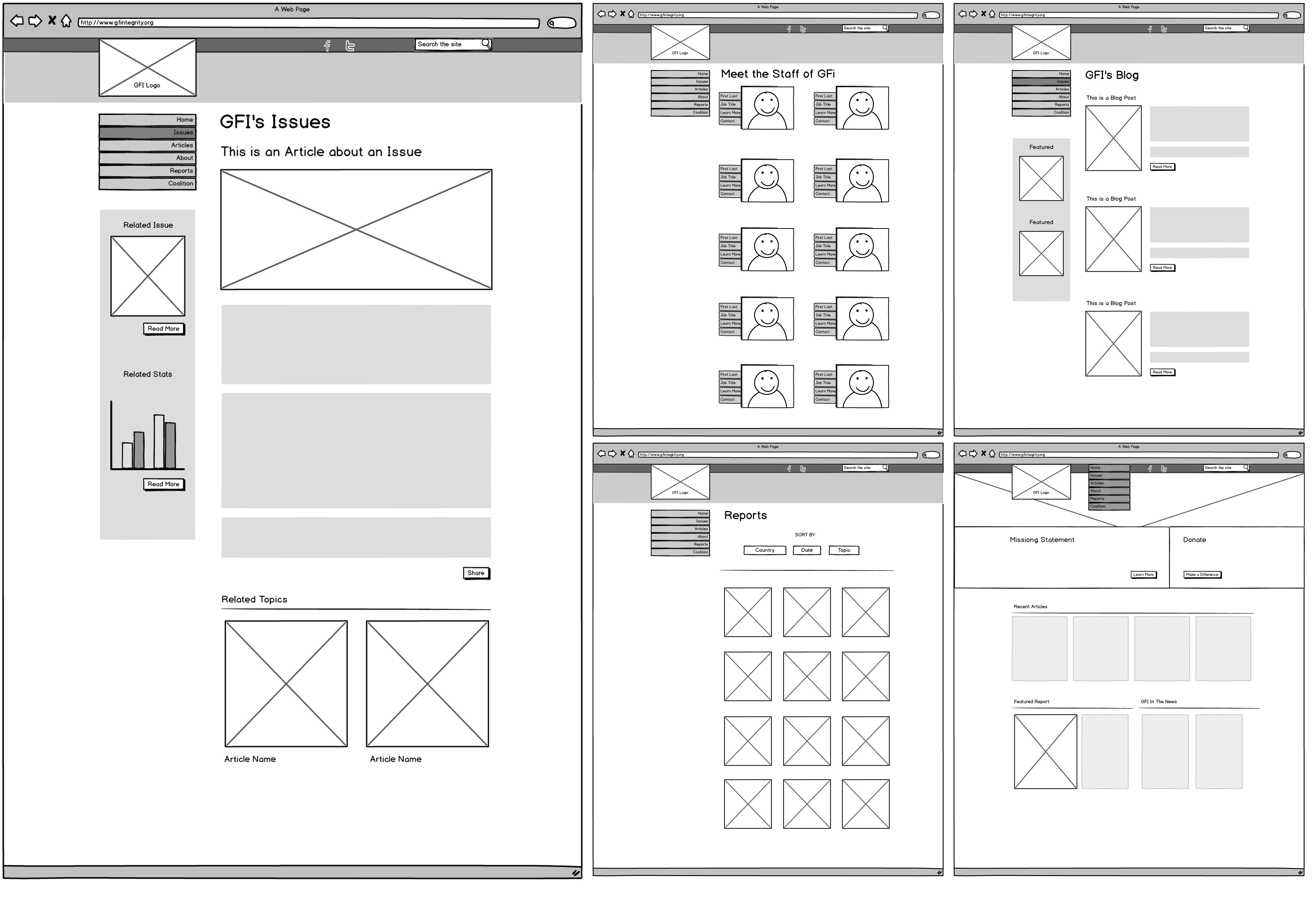
Wireframes
We sketched and sketched and sketched. We focused heavily on the navigation. We explored dozens of ways for it to function on mobile and desktop. We ended up landing with something as simple as the nav itself. A full width bar that ran across the very top of the browser and as you scroll down, should you choose to scroll back up, the nav would re-appear for easy access.
Designing the brand
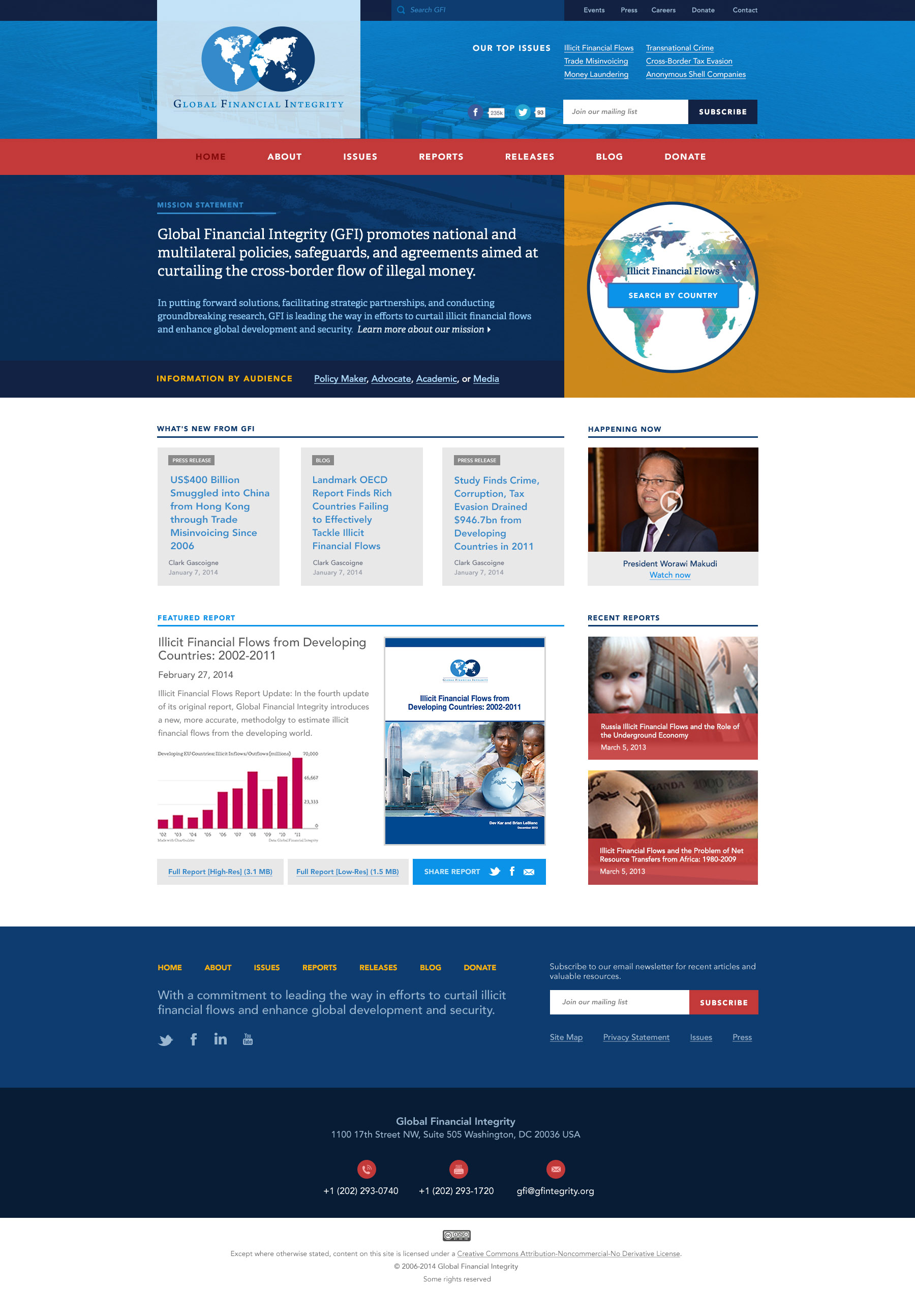
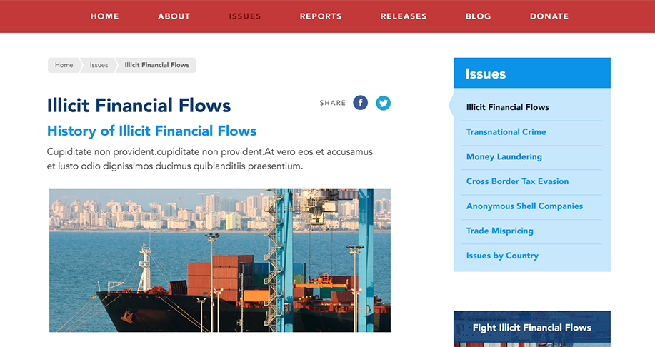
We brought in photography to help communicate the mission of Global Financial Integrity. A lot of what the org reports on is illegal money's leaving country with cargo ships. We wanted to show these ships in action to illustrate the scale at which these illegal moneys are set at.
I expanded the brand colors to include more of a variety, where you will see the red, yellow and gray. We used a bootstrap grid and designed a polished, clear and informative website. We thought about different pathways (which was informed by the card sorting exercise) which is where you will see Top Issues, Information by Audience, What's New and of course finding anything you need in the main navigation.
Made the mission a design priority
GFI's goal was to accurately communicate their mission as they had problems with folks in their space neglecting to know who they were. We placed their mission at the optimal reading location on the homepage and used strong imagery of boats, which is typically how money leaves said countries. By expanding their color palette beyond the blues in their logo, their website has clear hierarchy and a fresh new look.
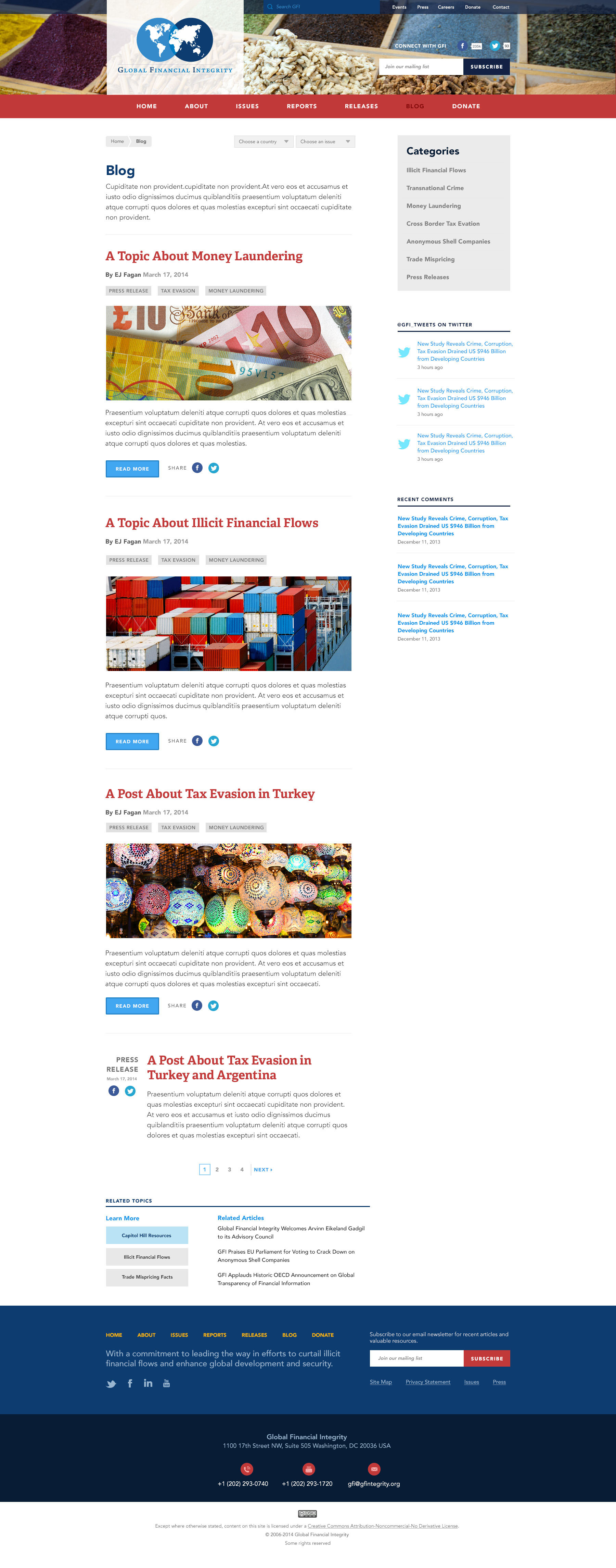
GFI produces a lot of written content. Creating an engaging blog page was essential in ensuring strong readership.
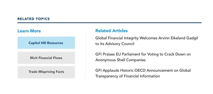
Learn more displays similar topics
The learn more is smart. It populates other related topics akin to the page the user has already chosen creating a personal experience.
